
Essays |
The
Consumer
Demand
Curve
by Michael T. Martin
|
The Spending Hyperbola represents only what is physically possible, not what people will actually do. The square hyperbola is therefore merely a mathematical identity: you can't argue with it, it is a fact. What people will actually do requires a different kind of curve: a "behavioral" equation that represents what people do as a group. When people leave a football stadium after a game, you cannot predict what any one person will do, when they will leave or what direction they will take, but even the dumbest spectator can predict pretty closely what EVERYBODY will do as a group, when they will leave, and which direction they will take. That is what behavioral equations do: they approximate the behavior of groups under certain circumstances. That there is some uncertainty is represented on the graph of this equation by the width of the line produced by the behavioral equation. You are about to develop a behavioral equation in just a minute and you can decide yourself how wide the line should be. Naturally, the world is full of whackos and eccentrics who will not do what the line says they will do, but you will soon see that individuals don't really matter in behavioral equations just like they don't matter in traffic patterns after a sporting event: their eccentricities tend to cancel each other out.
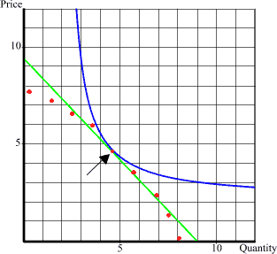
It is safe to say that MOST people allow price to influence how much they will spend. If the price is too high, they may decide not to buy at all. If the price is too low they may become satiated before they spend all the money they have available. The reality of the world is that people want all kinds of things and they have to choose where to spend the finite amount of money they have. They look at different kinds of items and decide which is most important to them and then decide to buy according to some priority of needs within them. At the same time, any decision to buy one item means some other item must be foregone. The consumer therefore has to consider the personal attractiveness of each item relative to each other item when allocating money to spend on it. As a consequence, if price is high on one item, even if desired greatly, the consumer may forego buying it simply because the same amount of money can buy a larger quantity of other items. You may, for example, prefer apples to oranges: but if it costs the same to buy one apple or a bag of oranges, most people will buy a couple oranges and spend the rest of the money on something else. Conversely, if there is an unusually low price on some item then the consumer may decide to buy a lot of them and forego some other item with a higher price. The classic example is the decision between steak and chicken: steak may be preferred over chicken by many people but even the heartiest steak eater may buy only chicken if the price differential between them becomes too great. This means that consumers exhibit a predictable form of behavior in regards to price and quantity. Generally speaking, the higher priced something is, the fewer items the consumer will purchase, while the lower priced something is, the more items the consumer will purchase. Notice that our spending curve requires the same thing, but what our demand curve predicts differs radically from our spending curve which says the consumer will always spend the same amount of money. If we were to observe consumer behavior at various prices for some item, it would typically look like the red dots next to the blue line. It shows that consumers do not always spend the same amount on an item, any item. They tend to decrease purchases rather rapidly when prices rise, and increase purchases when prices decline, although they can become satiated. Economists typically draw a straight line through the dots and call it a demand curve (the green line). A linear demand curve may not reflect actual consumer behavior at the fringes, but it offers a reasonable estimate for the area where people are most likely to be in the market. Consider, then, that we have a demand curve from observing people's behavior at various prices (the red dots) which we estimate by the green line. No matter how that green line is drawn, there will always be ONE point (black arrow) on that line that is tangent to some square hyperbola, the blue line, and this point of tangency defines the maximum amount consumers are willing to spend on that item. As you can see, what happens on the fringes is somewhat unimportant. Even if we had a demand curve that exactly followed the red dots, it would have approximately the same point of tangency as the linear demand curve. The spending curve tells us how many items would be sold if we raised the price and consumers spent the same amount of money. Notice that the spending curve shows that consumers will buy fewer items if we raise the price: they have to because the same quantity at a higher price would require a larger amount of money. Thus our behavioral observation that people tend to buy less when price rises is actually a physical necessity. But most people will actually buy much less than the spending curve predicts: given a higher price, people will shift some of their money to buy other items and spend less in total than the spending curve predicts.
On the other hand, if we lower the price then the blue line says the quantity sold will increase, but more than likely consumers will buy less than that increase also. Again, behaviorally people will likely decide to buy fewer than expected simply because they will reach some degree of satiation. I might decide to buy five apples instead of three when the price declines but even if the price goes WAY down I'm only going to buy at most a dozen apples because that is all I want to eat. This, in turn, means that on the graph each new dot representing the combination of price and quantity sold at a lower price will be to the left of the blue line. It is also likely that both the higher and lower the new price, the further the resultant new dot will be away from the blue line. We can therefore be fairly certain that any points on the graph representing what people will actually spend will not be shaped like the blue line: it will touch some blue line at the one point of tangency, but all other points will diverge from the blue line because people rarely spend the same amount of money for different quantities of the same item. At this point we cannot say the spending dots representing actual behaviour will be any particular line, but we can say fairly certainly that it will be less curved than the spending curve. We know it cannot be more curved than the spending curve because that would put some combinations into the impossible area right of the spending curve and we generally observe that people do not spend the same amount of money if prices are raised or lowered. We can be fairly certain that if price is raised far enough the demand will go to zero, and we can feel fairly certain that before price goes to zero people will become satiated and refuse to buy a larger quantity simply because the price has declined.
You can choose any line you want for a demand curve, just recognize that for the real world we will almost always be analyzing points close together because that is the way prices and quantities appeal to consumers and because the costs involved in supplying the items will constrain prices on the low end and competition will constrain them on the high end. It is my own considered opinion that real demand curves are elliptical (much like the line of dots on our graph): they start out relatively flat because consumers don't buy hardly any until they reach some relatively attractive price range and then the quantity sold increases rapidly until at some point consumers become satiated and demand remains constant even if prices drop towards zero. But that means the only "relevant" price range is at the point where the line changes from horizontal to vertical and this can be approximated by a straight line. Having said that, there are many straight lines that could apply. If consumers tend to buy the same quantity even with large price changes (price "insensitive"), then the demand curve may be almost vertical, whereas if people tended to be very sensitive to price the demand curve could be almost horizontal. An elliptical demand curve says people are very price sensitive at some high price but soon become price insensitive as price declines. Therefore the choice of a straight line may simply represent one particular phase of a behavioral continuum. It does not really matter for most analyses, as we will see. Introduction | Previous | Next: The Point of Maximum Revenue
|
 Having said that, let us take a look at the spending curve represented by the blue line on the graph to the right. As we noted before, this line represents the maximum amount of money that consumers are willing or able to spend. However, this blue line says that people will always spend the same amount of money regardless of the price of the item they want to buy. That behavior is not characteristic of most people.