
Essays |
The
Spending
Hyperbola
by Michael T. Martin
|
If you had ten dollars to spend, you could spend all of it in several different ways: you could buy one ten dollar item; you could buy ten of a one dollar item; you could buy two of a five dollar item or five of a two dollar item; twenty of a fifty cent item; forty items that cost a quarter. You can probably figure out the rest. There are many combinations of price and quantity that when multiplied together total ten dollars. It doesn't really matter whether we are talking about the same kind of item, or a mixture of items: candy, toys, widgets, or pencils. It doesn't even matter if all the items are the same price: only that they average some price. For this example we are only saying that you are going to spend the whole amount regardless of what you buy and the price of each item will average some price. This makes the arithmetic simple: multiply the price (P) times the quantity (Q) to get the amount of spending (S) available (S=PxQ). This example is only one instance of an infinite number of similar examples where only the amount of spending changes, such as the combinations of price and quantity that equal twenty dollars or a hundred dollars, or a million dollars, etc.
Naturally, the numbers "5" and "10" on the graph apply only to our example of combinations that equal ten and would not be the same on all the other combinations, but the numbers would be the only thing that changed. In other words, if you removed the numbers alongside the graph, it would be a generic graph that would apply to any amount of spending we chose. Conversely, choose any amount of spending and the graph of price/quantity combinations would look exactly like the graph at the right except for different numbers alongside the axes. The mathematicians' name for the blue line in this graph is a "square hyperbola". To a mathematician it doesn't matter what the numbers you are multiplying together represent: as long as the "product" of all the combinations equal the same amount, it forms a square hyperbola. But you really only need to remember that when we show you a graph that looks like this it represents a FIXED total amount. The blue line in the graph simply represents all the possible combinations of price and quantity whose product equals some particular fixed value, even if we don't need to know what that value actually is. This line is important because if you are buying, then somebody else is selling. The amount of money you are willing to spend is the amount of revenue the seller will receive. Since you only have some FIXED amount of money, the price the seller sets on the item will determine the maximum quantity that you will be able to buy. If you want to buy cotter pins and you have ten dollars to spend, then if cotter pins cost a penny each then the most you can get is a thousand, but if they cost a dime each you can get a hundred. Whatever price the seller sets, the blue line shows the combination of price and quantity that will total your ten dollars. The graph above is therefore a useful tool for analyzing situations where some fixed amount of money is available to be spent. It may represent all the money in your pocket, all the money in the economy, or all the money available for some category of purchases (housing, food, cars, etc.) and even if we only approximately know what that amount of money is (the width of the blue line represents this uncertainty), we can use the square hyperbola as a model of prices and quantities that will actually be spent because we know that all other combinations are either impossible (because they total more money than is available) or inadequate (because more money could be spent). From the seller's point of view, the graph above is the starting point for all economic decisions. Since the consumers in the marketplace have some finite amount of money available to spend, the sellers in the marketplace cannot, under any circumstances, get more money from them than what they have to spend. Thus every combination of price and quantity to the right of the blue line is simply impossible: the money isn't there. However, sellers could obtain less than what the consumers are willing to spend, represented by every combination of price and quantity to the left of the blue line. The reality of life on planet Earth is that resources at any particular time are finite: they represent some fixed amount. The blue line on the graph above represents the generic form of all economic analysis: change the numbers to represent any resource you want, but the graph will always look the same. Measure price in Yen or oranges (barter), the graph still represents what is physically feasible. It does not represent what you or anyone else will actually spend, but it does represent what you are capable of spending. And it turns out that this graph is the beginning for figuring out what people will actually spend. Introduction | Previous | Next: The Consumer Demand Curve
|
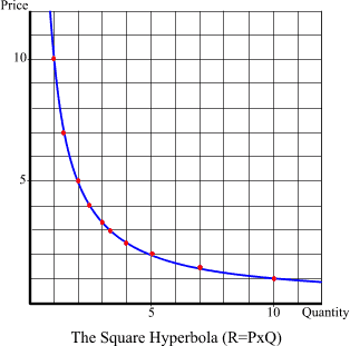 When you find all the combinations of price and quantity that total the same amount of money (whatever that amount is), you could plot these combinations as dots on a grid of lines and the shape of a line connecting all these dots would look like the blue line on the graph shown at the right. Whenever you find all the combinations of two numbers multiplied together that equal the same amount, you will discover they form a line that looks just like the blue line on the graph at the right.